

MCADAMHS
IS4S

We have the opportunity to do a wide range of work - and working in the tech space gives us a chance to flex our tech muscles. The team at IS4S created the pntOS brand and came to us to create a visually stunning brand identity and supporting elements, that with quickness, efficiency and flexibility, conveyed the product’s innovative solution to navigation.
Year
2020
What We Did
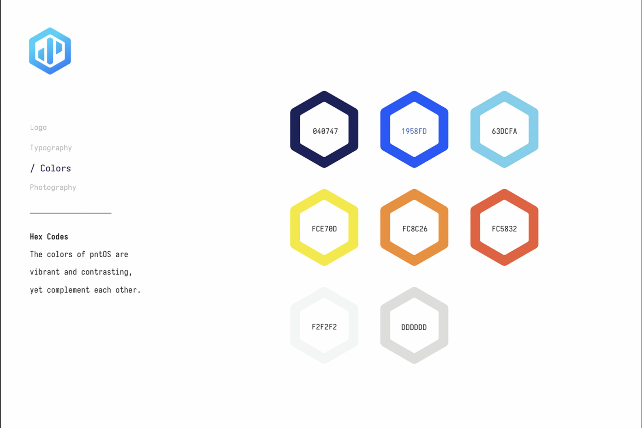
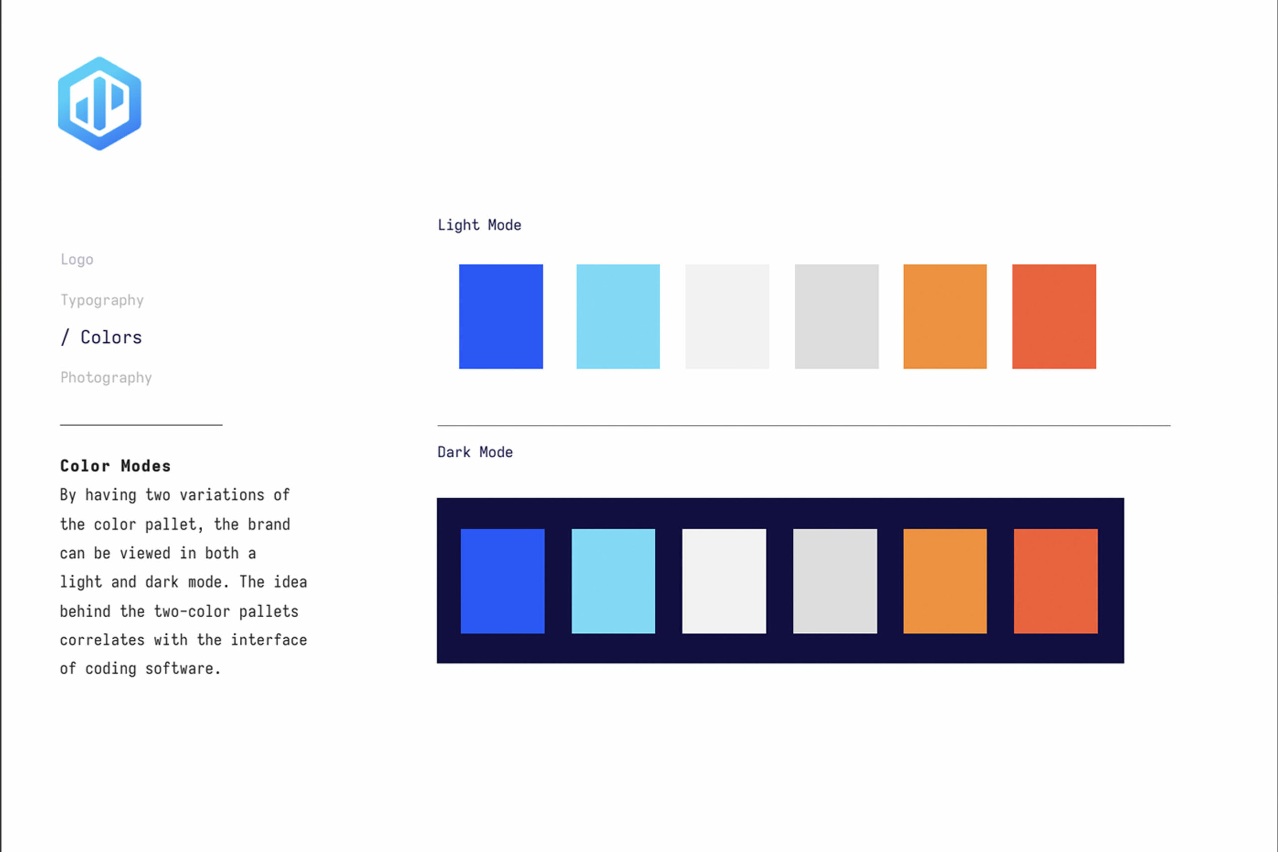
Strategy, Writing, Animation, Illustration, Print, Design, Branding, Concepting
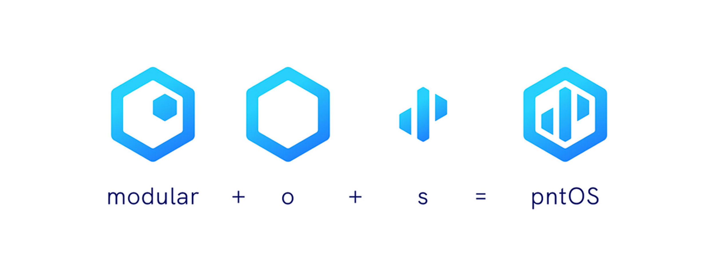
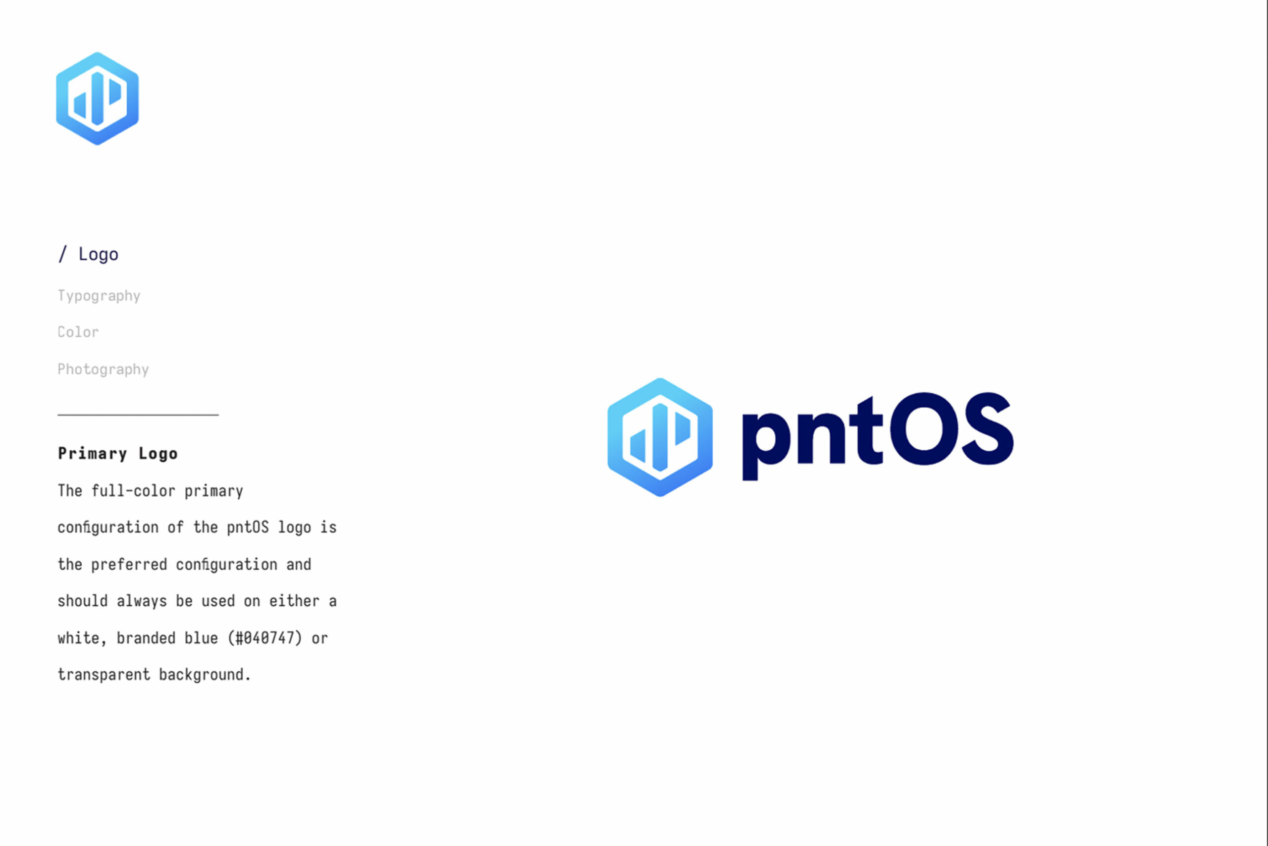
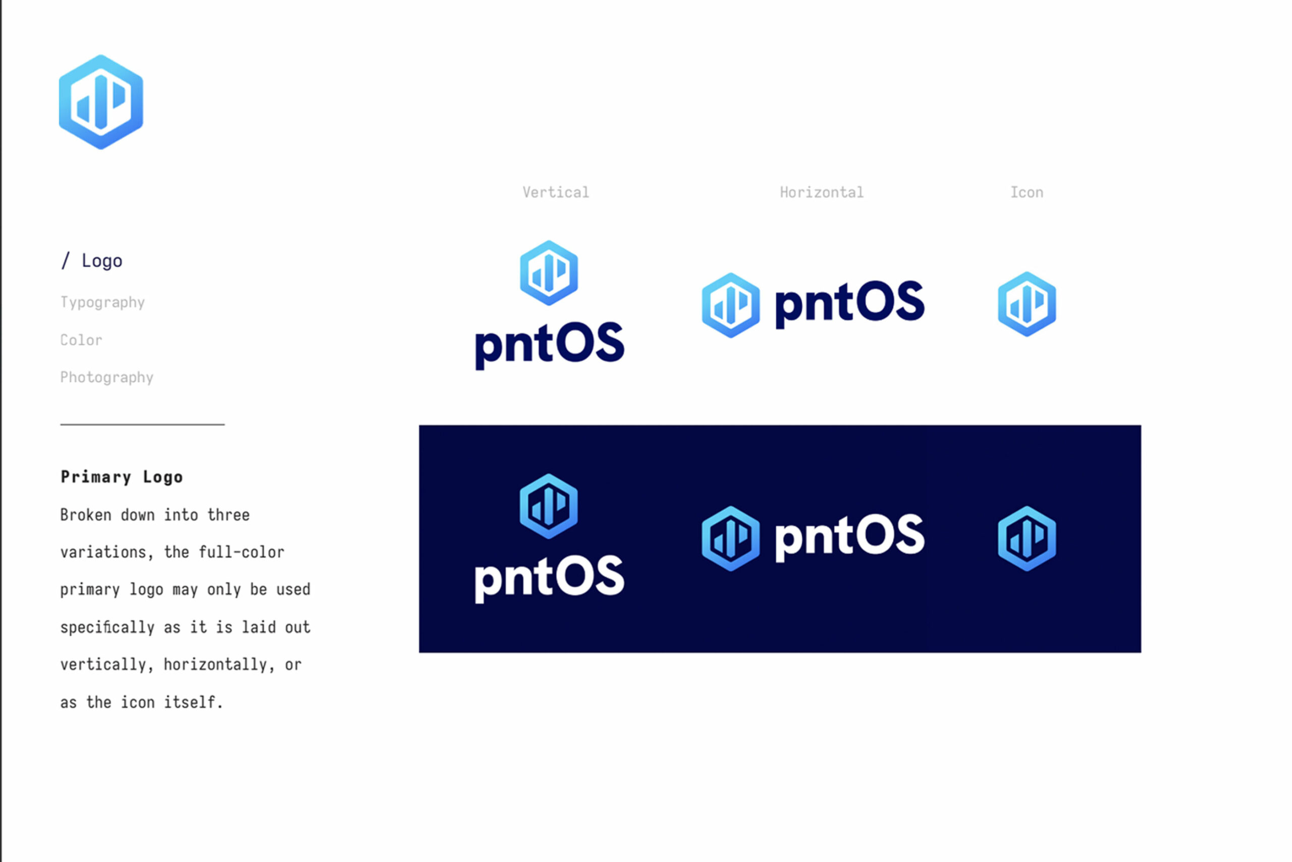
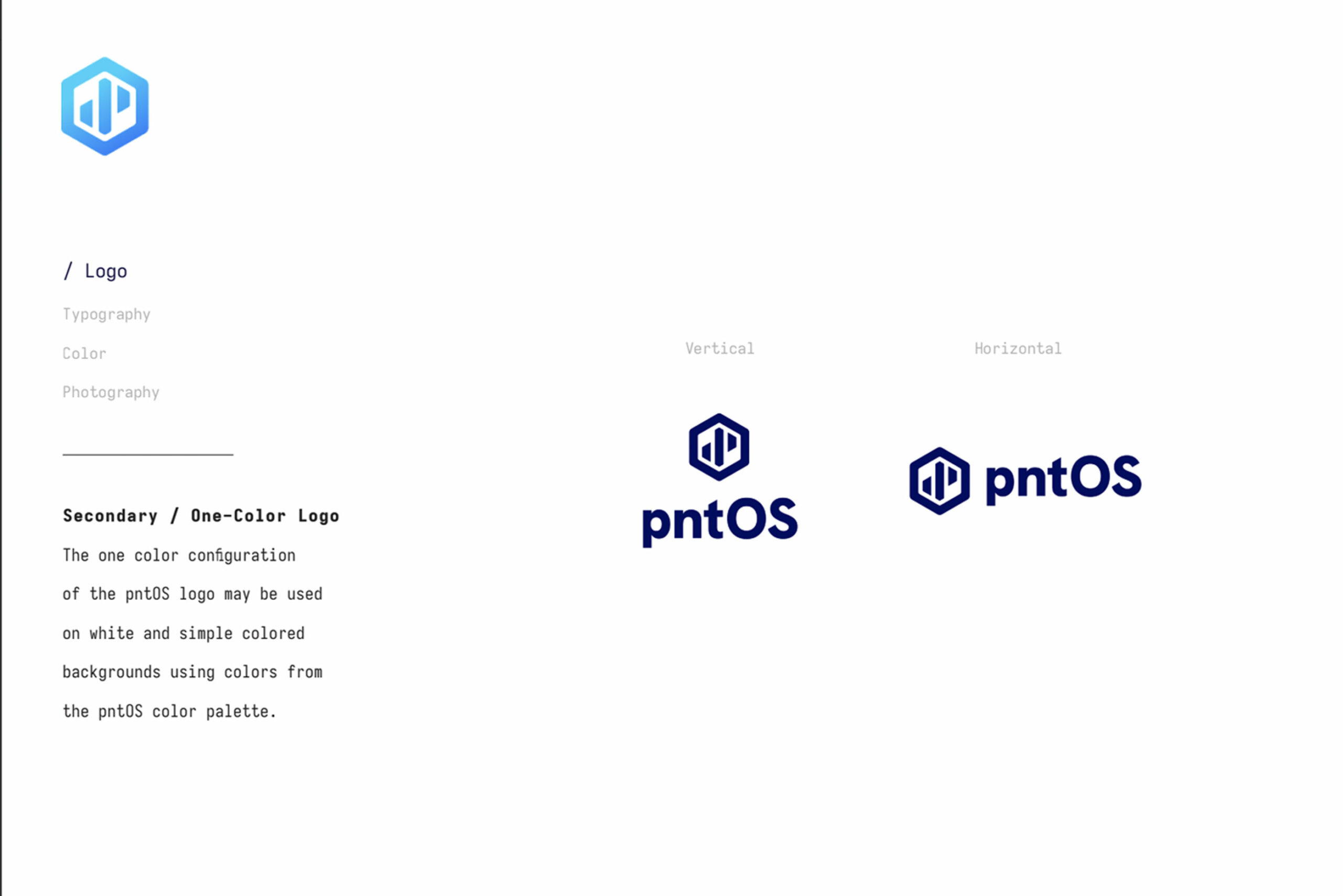
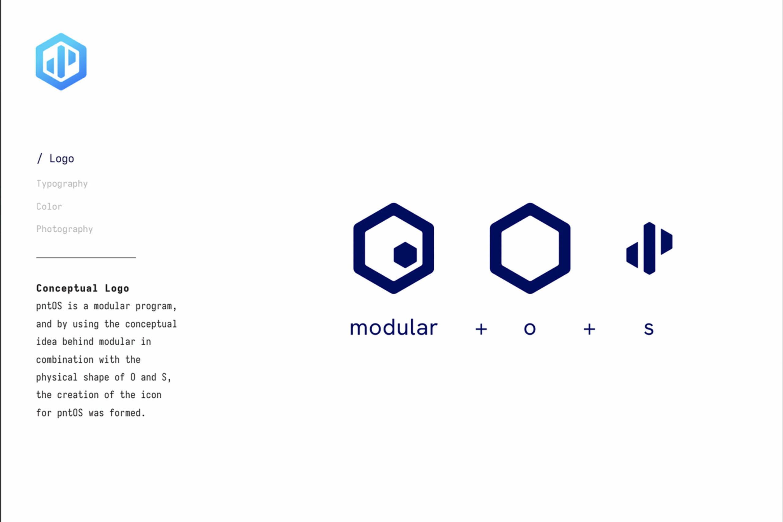
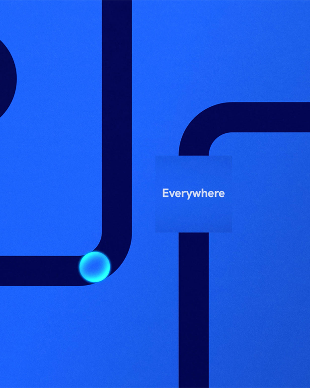
As efficient and fast as the operating system itself, this mark speaks to the modularity and pluggability of pntOS. By using the conceptual idea of modular, in combination with the physical shape of O and S, the concept of the icon for pntOS was formed.
Along with the initial brand, the pntOS team asked us to create animated content that compliments the brand and accurately explains the pntOS system in an easy-to-digets way.
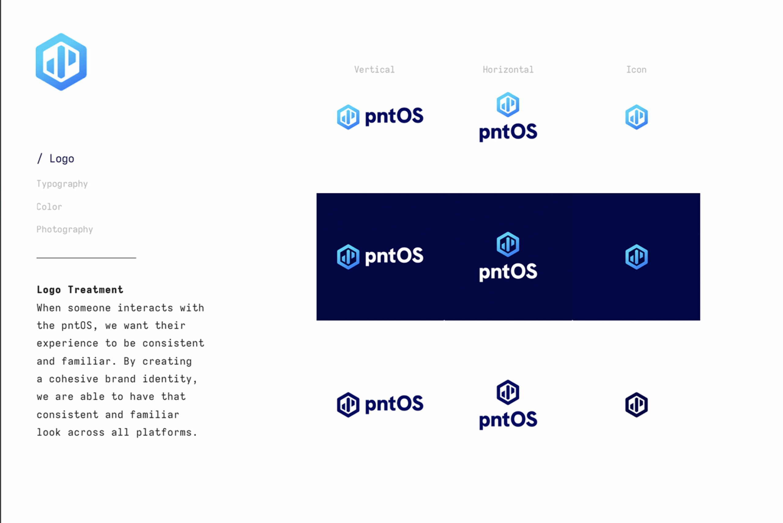
With the launch of the brand, pntOS has a cohesive look they can use to present themselves as the established leader in this industry. Focusing on open, modular and pluggable as our words of inspiration, we were able to visually showcase the main advantages of the operating system. This is only the beginning for pntOS. We continue to partner with pntOS and create new materials for them as they grow and create a profound impact on the world of position, timing and navigation.
RECOGNITION
AAF Dayton Bronze Addy