The Center for the Female Athlete: Brand
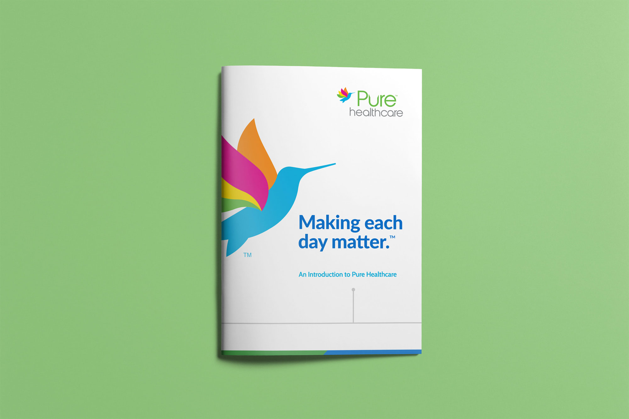
Pure Healthcare
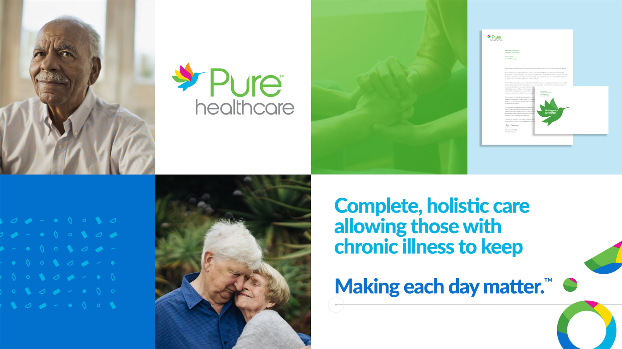
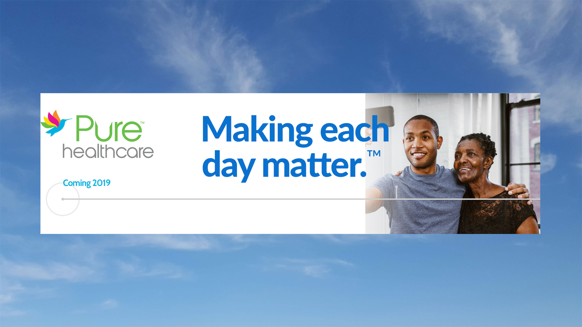
Making each day matter means doing what means the most to you. It could be as simple as walking, making a meal in your home, or being there to watch someone you care about achieve a goal in their life. We created the brand tagline, vivid color palette and supporting materials to bring a lightness and life to what could be a heavy time for patients and their families. This brand was created to focus on patients who are living each day to the best of their ability, help them forecast the items they can look forward to, and focus on getting back to even the small things that make their lives matter.
Year
2019-2020
What We Did
Animation, Branding, Design, Photography, Social, Web Design, Digital, Print, Illustration, Writing, Video, Messaging, Strategy
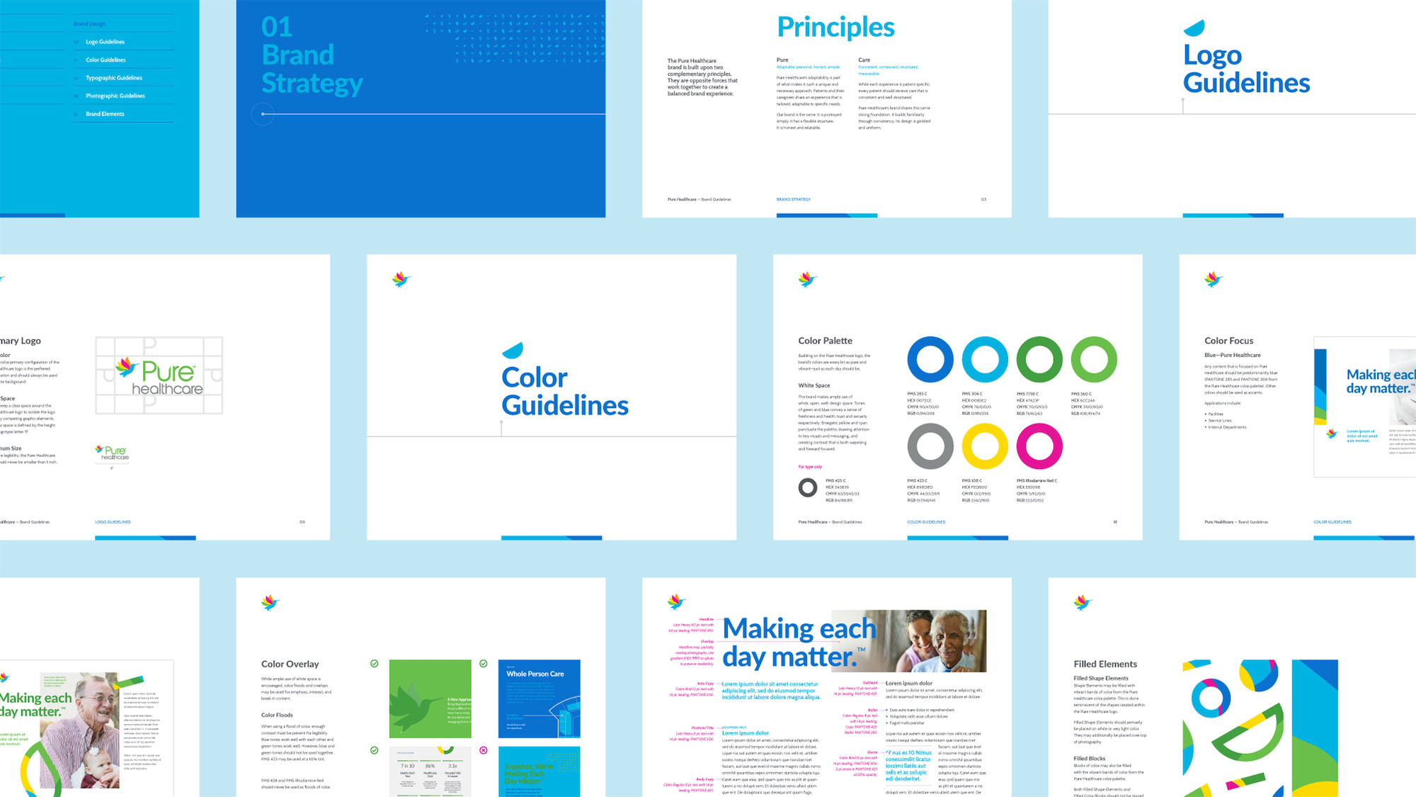
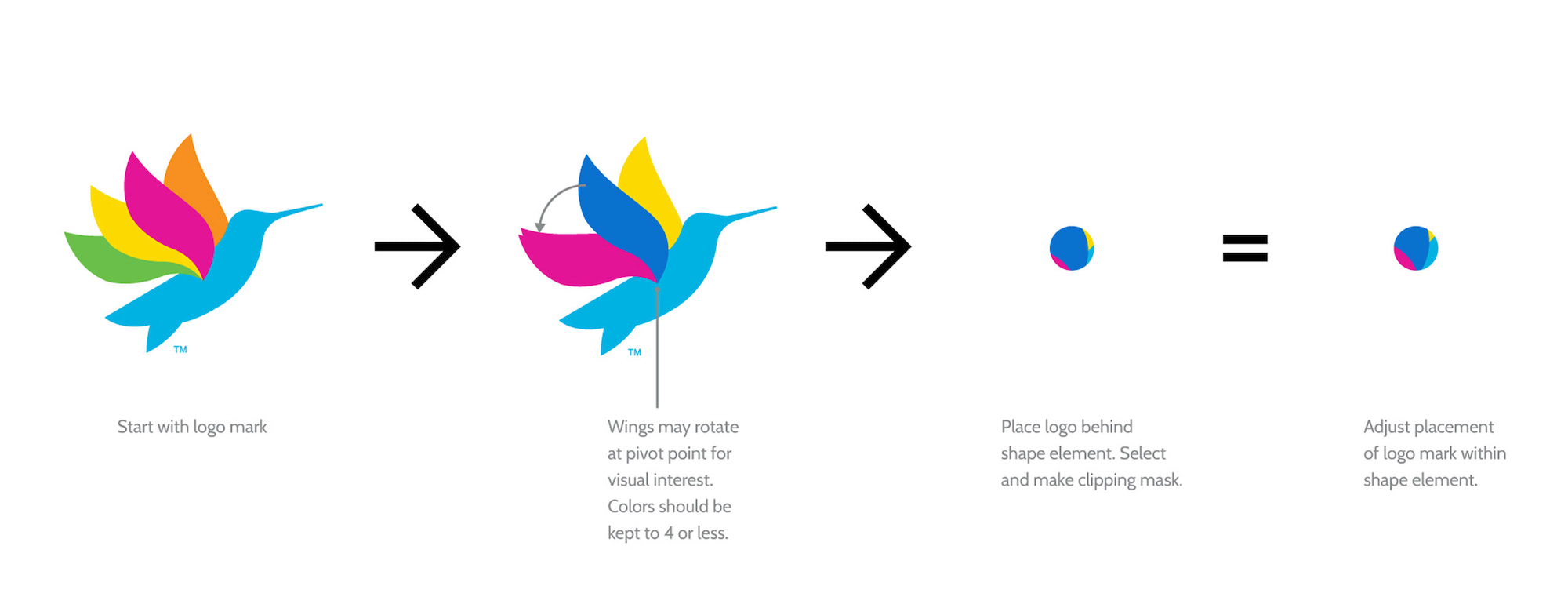
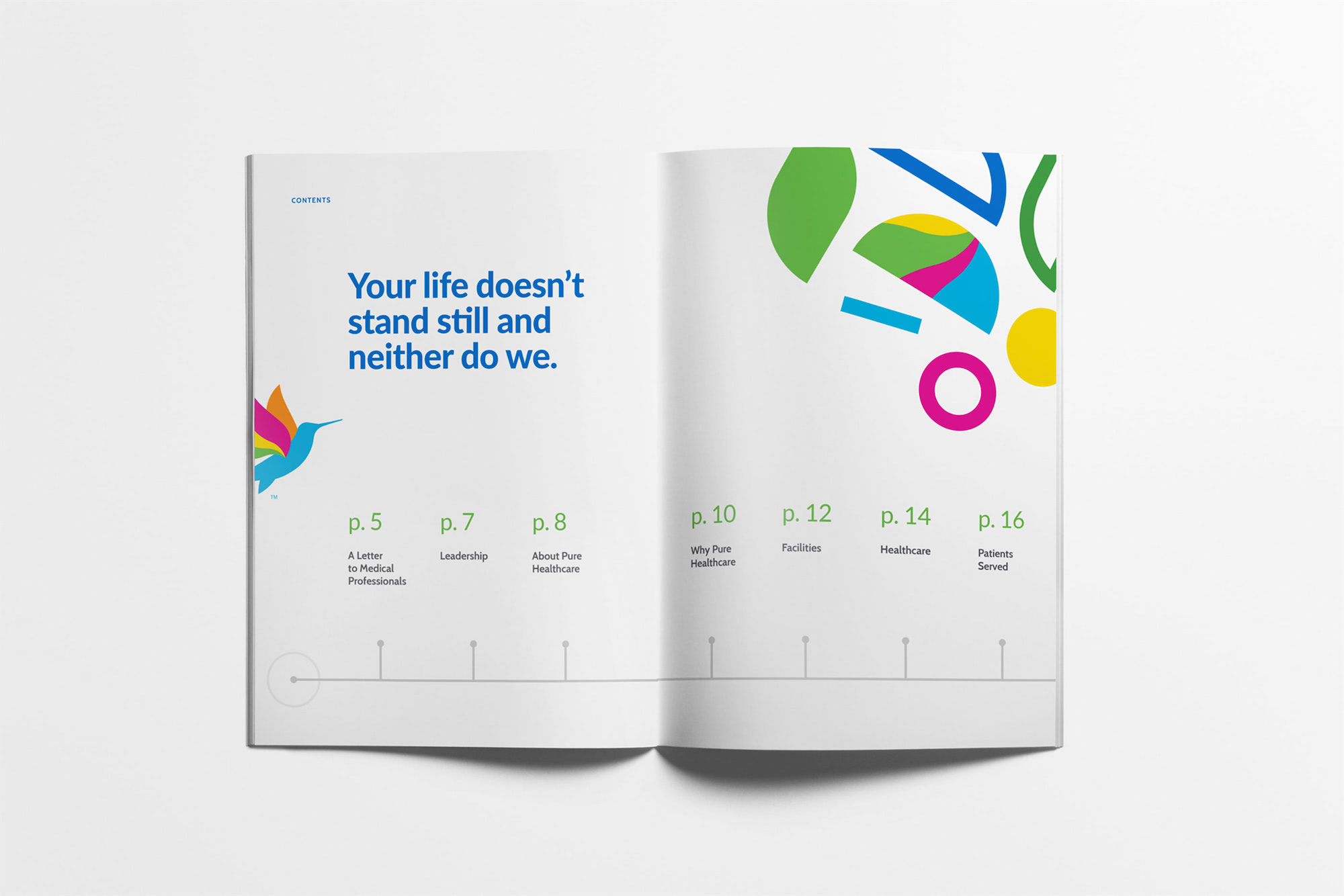
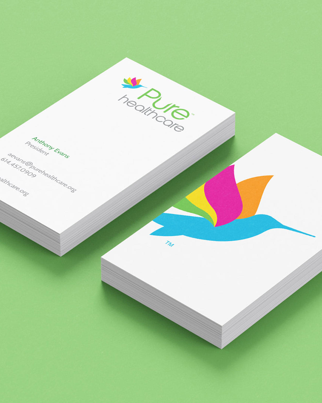
The secondary logo mark is the hummingbird icon: a symbol of tenacity and endurance. The Pure Healthcare hummingbird represents the strength it takes to face and manage a chronic illness. The colors represent the unique individuals, families, and caregivers who are a part of this journey. This helped shape the visual and illustrative elements of the identity.
We designed and created a new website, billboards, video stories, television commercials and many collateral items to launch the brand. A direct-mail campaign promoted Pure Healthcare and raised awareness over the course of the first few months. Social media and digital campaigns helped shift the language to consumer and patient awareness.
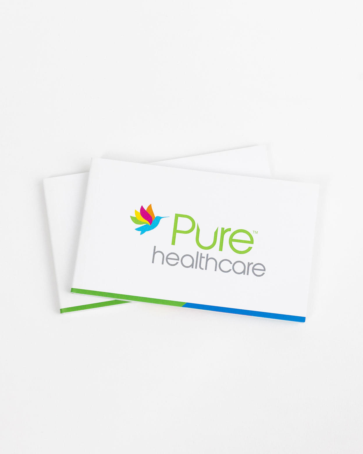
One of the unique printed touchpoints was a custom flip book featuring the hummingbird logo mark and brand tagline that was distributed during the ribbon cutting of the new building.

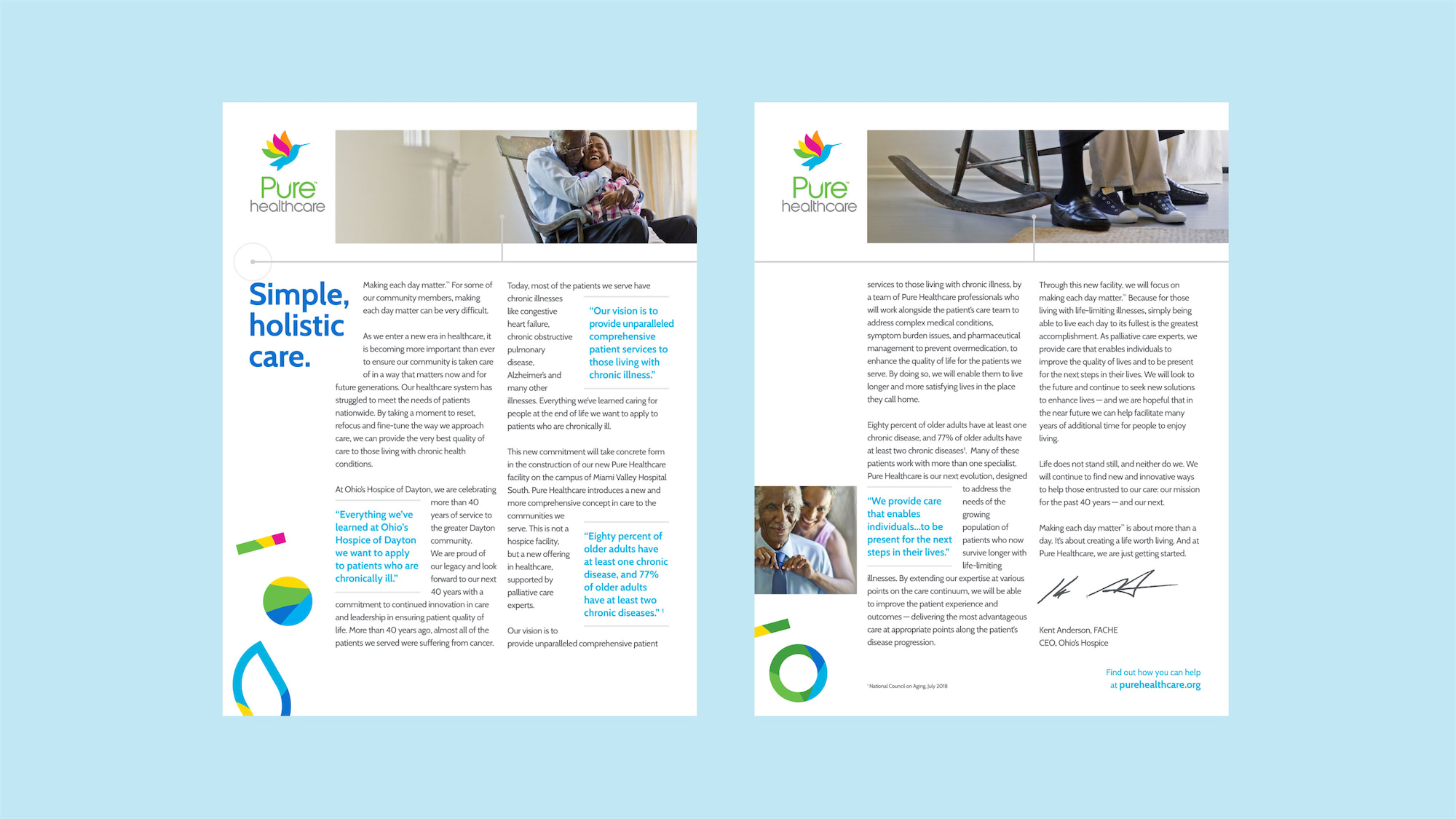
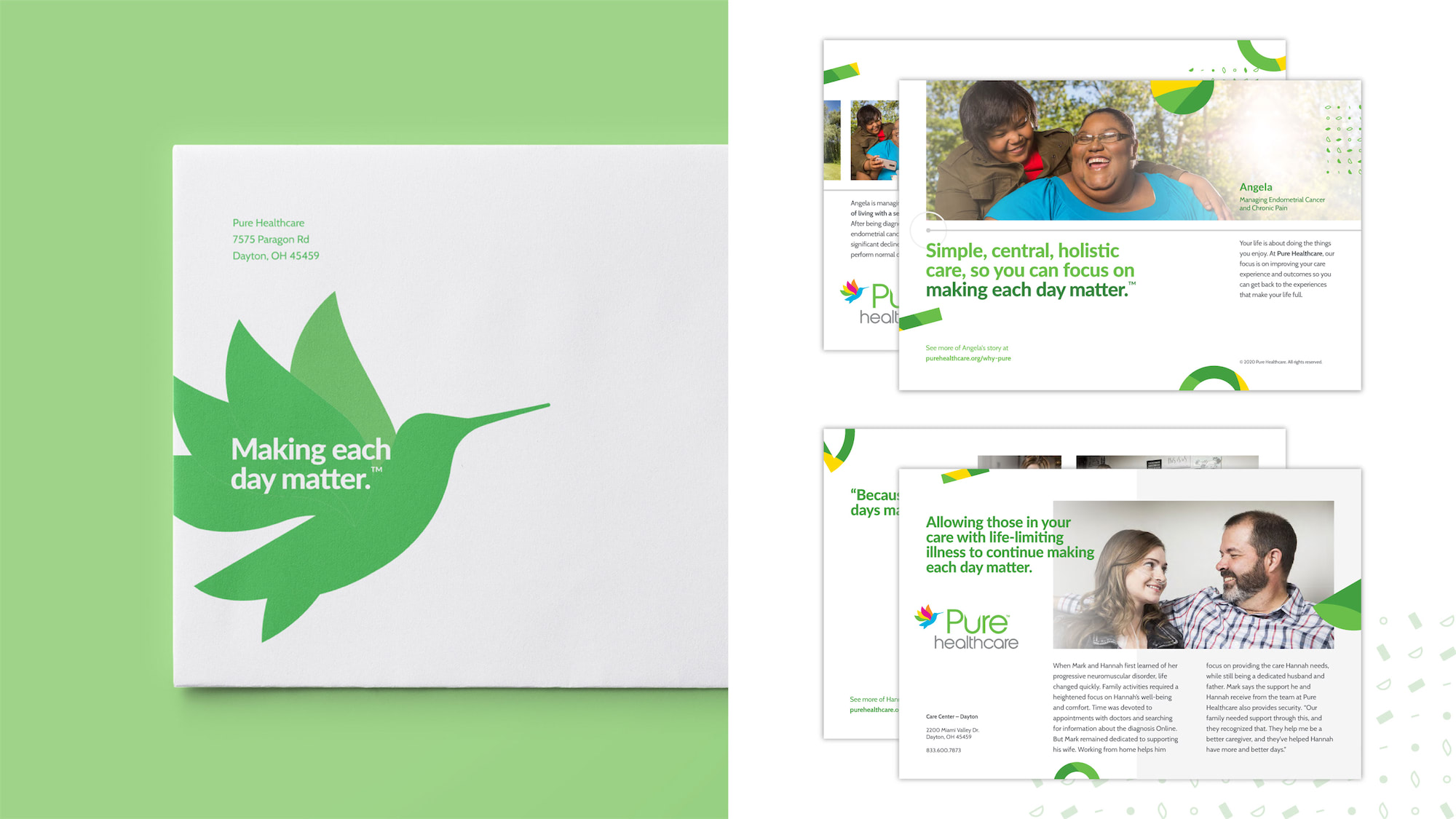
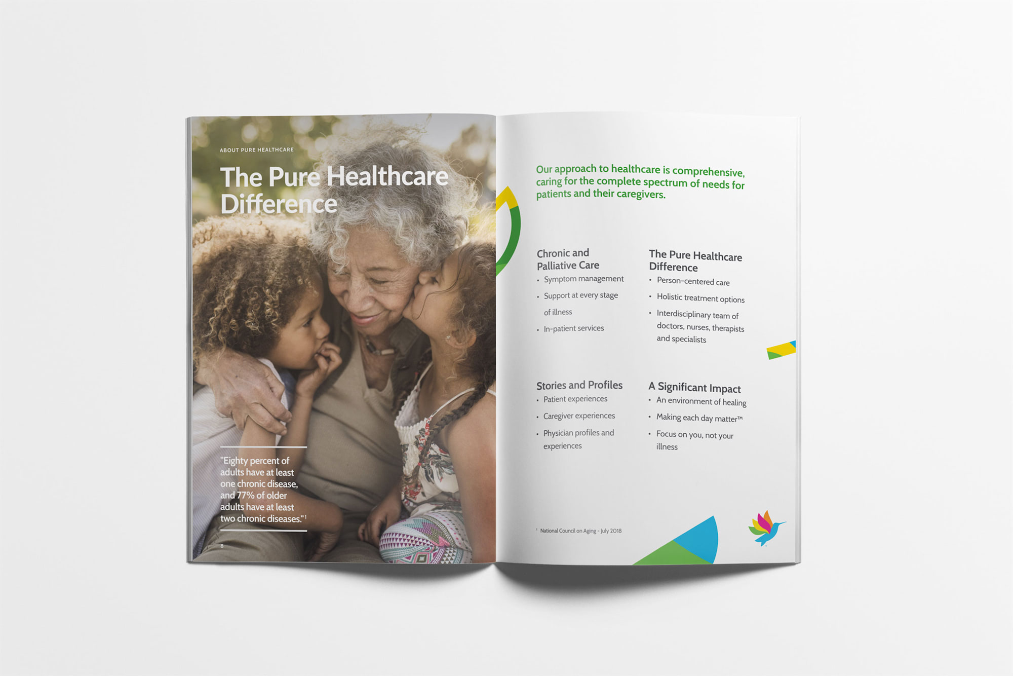
The core of Pure Healthcare’s ‘why’ is caring for the whole person, not just the diagnosis. Telling patient stories was one of the ways we highlighted the individuals at Pure Healthcare and provided hope in spite of their chronic illness. Pure Healthcare’s approach to care is comprehensive, across the complete spectrum of needs for patients and their caregivers.
With the launch, this brand received praise for being ‘different’ in the healthcare space. Focusing on life, living and the future through bright colors and upbeat language gave patients and their families a safe place to recognize they were being cared for. Materials were printed with touch in mind. Interacting with a brand that focuses on forward movement through the use of the hummingbird and animation. Each new brand step will be an additional opportunity to continue making each day matter.
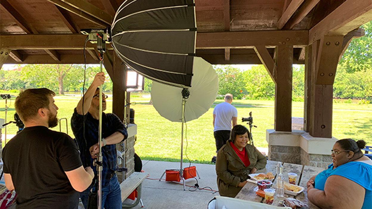
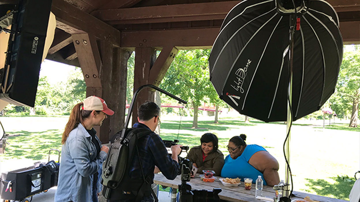
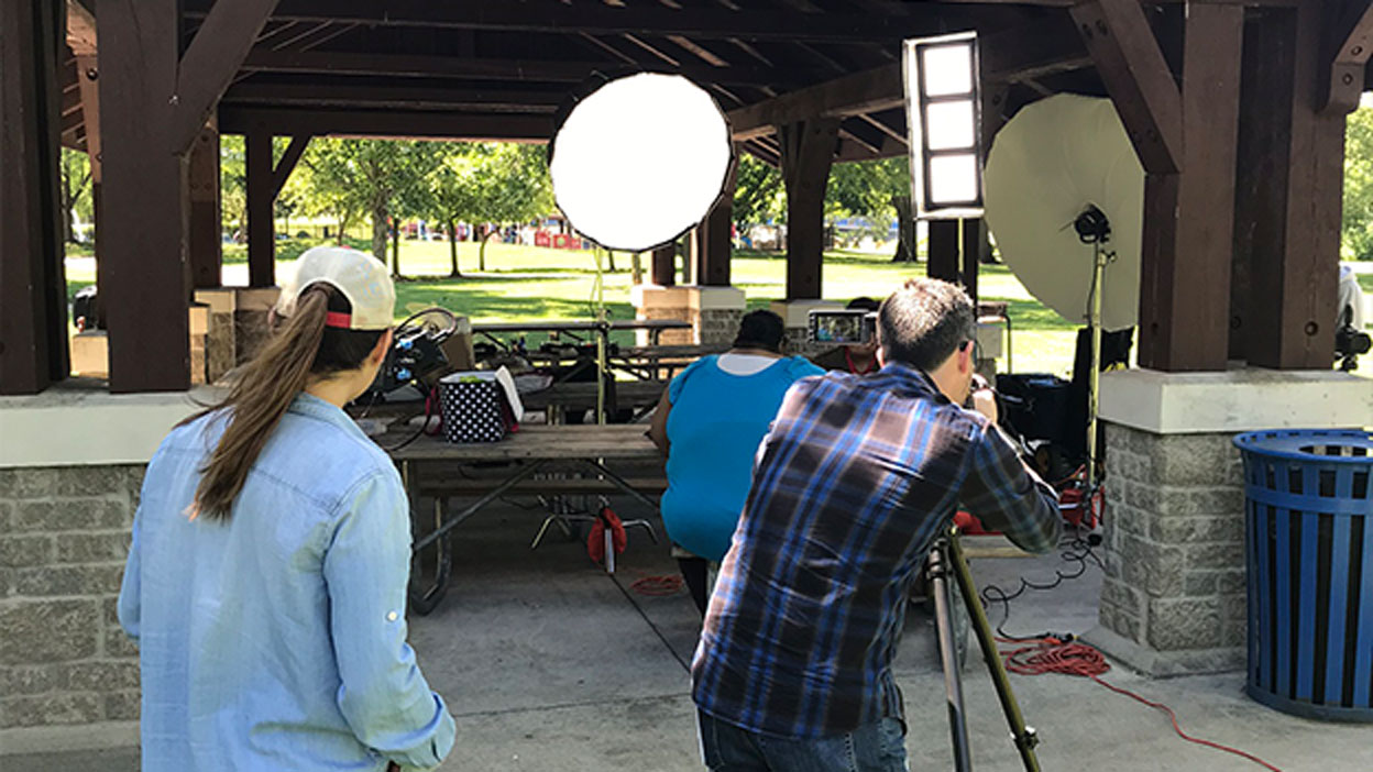
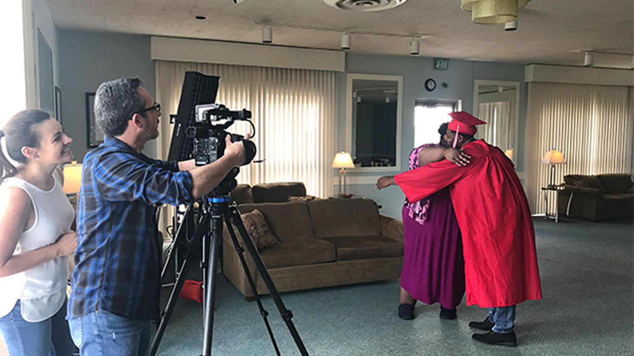
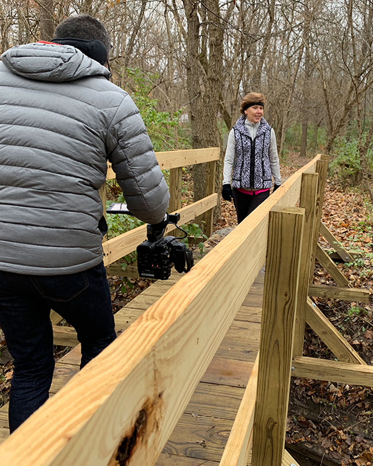
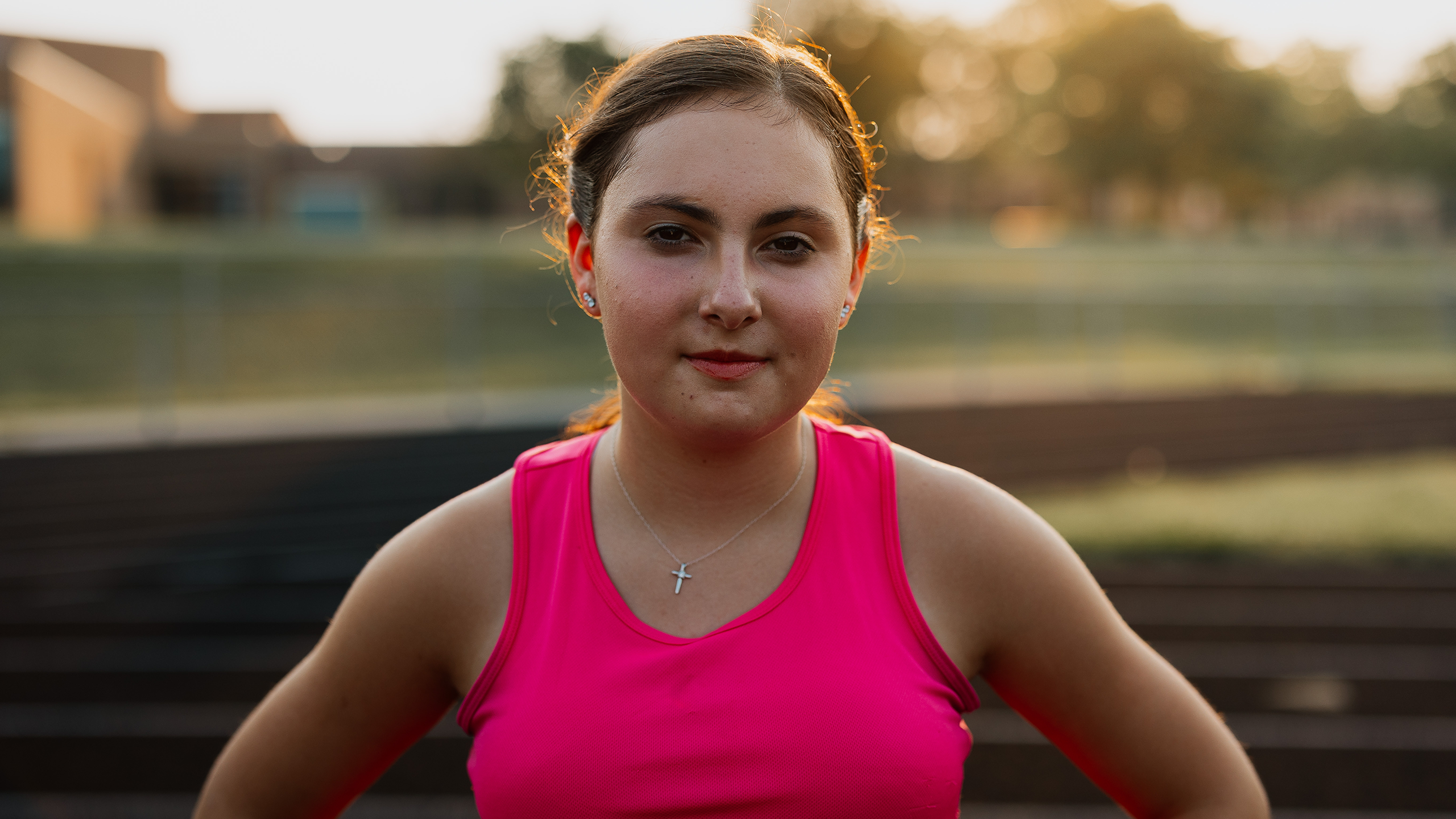
We work with actual patients quite often at Boom Crate, and something we take very seriously is ensuring patient comfort during the filming process. When patients put themselves in the vulnerable position of sharing their stories, we want it to be a simple experience. Filming with these patients was nothing short of inspiring.